Facebook Testing A Blindingly White UI For Its Android App
One of Facebook’s more readily identifiable features is the use of blue where the color is featured prominently in its logo and its website. This is also applicable for its mobile app, but according to a report from XDA Developers, it seems that Facebook could be trying to create a cleaner look.
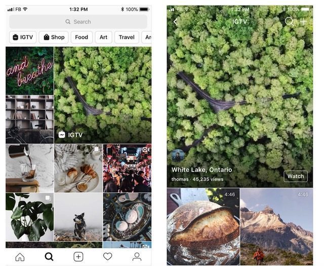
The report claims that Facebook is testing out a brand new UI on its Android app where the company has seemingly purged the blue from the app’s design in favor of white. This creates a very stark and almost blinding look for the app, although we can’t say that it looks very good. However it is possible that this is only a test which means that Facebook might not have any concrete plans to release it.
At the same time it is also a little contradicting because it wasn’t too long ago that Facebook Messenger gained the ability to enable dark mode, so for Facebook to opt to go in a completely opposite direction for its mobile app is a bit strange. That being said, it is unclear how many users are seeing this new color scheme as it appears to have been enabled server side, meaning that there is nothing users need to do on their end to enable it.
Google had previously confirmed that dark mode actually plays a pretty big role in helping reduce battery consumption on our phones, so if you’re someone who spends a lot of time on Facebook, this potentially new color scheme might not do your battery any favors.
Facebook Testing A Blindingly White UI For Its Android App , original content from Ubergizmo. Read our Copyrights and terms of use.


